The world of the web is constantly changing, and your website needs to keep up in order to drive traffic and business in your direction. Your website is like a pet, and it needs regular attention in the form of updating and tweaking to design and content. Your marketing budget needs to include regular website maintenance, regardless of whether you’re going to do it yourself, or hire a designer. Here are five reasons why you probably need a website redesign.
1. It should be mobile-friendly (responsive)
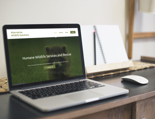
Smartphones and tablets have changed the approach toward design and user experience. Mobile web usage is growing by leaps and bounds, so you need to make sure your website is responsive, and can be viewed on a wide variety of devices, including desktops, laptops, tablets, and smartphones. By incorporating responsive design into your new website, you’ll be able to reach a larger audience than you would with a website that’s not mobile-friendly. This is especially true now that Google actually ranks your website based on its mobile-friendliness. So if your audience is searching for your services on their mobile phone, and your site isn’t responsive, your competitors might show up in search results ahead of you.
This sounds complicated, but it isn’t! Most WordPress premium themes are now responsive, and the beauty of WordPress is that after the initial redesign, you can do as much of your own updating as your comfortable with.
2. It should incorporate social media
Small businesses have a lot to gain by integrating social media into their web presence. Not only do social media sites like Facebook and Twitter serve as general hangouts, but they also provide opportunities to spread your message as a business, to connect with your target audience better and to get to know your fellow small business owners more personally. You can also learn about your competition.
If you don’t have some sort of social media presence, you are behind the times (and probably behind your competitors, as well). At the bare minimum, your website should include links to your social media profiles. It should include social sharing tools that make it easy for users to share, tweet, or pin your content. Redesigning your website with social media in mind, can help drive traffic to your Facebook page, Twitter account etc. which makes it easier for users to connect with you socially and spread the word about your business via their social networks.
And the reverse is true as well, since most social media platforms offer inexpensive advertising, which will drive traffic back to your website.
3. It should be easy to use
The content and design of your website should be engaging, accurate and fresh, to establish credibility. If your site’s visitors can’t find what they’re looking for, they’ll get frustrated and leave (and they probably won’t return). If your website is difficult to navigate, you’ll definitely want to look at a redesign that’s user-friendly and keeps your customers and prospects happy. Regardless of what artistic direction you take with your site, it’s design should keep the end user in mind. Ease of navigation is a major component of good web design, and that means keeping your menus in the same place throughout the site, using clear and easy-to read fonts, and using design that aids legibility, and isn’t cluttered-looking.
The quality of the online relationship with your users and how well your website meets their needs has a direct influence on your bottom line.
4. It should incorporate your rebrand and any new features you’re looking at
Has your business undergone a rebrand, or had fonts and colours tweaked? You’ll most certainly need to reflect this on your website as well (along with your other marketing materials). And rebranding isn’t always just about a new logo and colours – it will often require an update to the content of your website, so don’t forget that aspect of your makeover. A website is only as good as it’s content, after all.
If you want to add a blog, forums, online store, or other major features or tools to your website, a redesign is probably in order, too, so that you can ensure everything flows seamlessly throughout the site, and it doesn’t look like the new feature was just tacked on as an afterthought.
5. It should stay up-to-date
The web world is always changing, and web technology that was cool and cutting-edge a few years ago may be out-of-date today (think Adobe Flash). Don’t expect your current website to last more than 6 months to a year without minor updating. Complete re-designs should happen every three to five years. That doesn’t mean it needs to look completely different every time, but back-end functionality will need to change, as well as tweaks to design. As technology changes, your website needs to as well. This is because the world’s most important search engine is constantly changing the rules for page placement, and you don’t want Google to dump your site because it has decided your site no longer meets it’s current standards.


Leave A Comment